Simple Pearson correlation with Python
Introduction
The Pearson correlation coefficient describes the relationship between two numerical continuous variables. When describing a sample, it is denoted by the letter r, and ranges from –1 to 1. A positive number indicates a positive correlation (that is, when the explanatory variable increases, the response variable increases), while a negative number indicates a negative correlation (when the explanatory variable increases, the response variable decreases). Values closer to –1 or 1 represent a stronger relationship, while those closer to 0 represent weak relationships.
For example, an r of 0.87 represents a strong positive correlation, while an r of –0.15 represents a weak negative correlation.
Squaring the Pearson's correlation coefficient generates the value r2, which is the fraction of the variability of one variable that can be predicted by the other variable. A common way to think of this is, "How much of the variation in x is explained by y?"
Note that the Pearson correlation coefficient is only suitable for describing linear correlations, and shouldn't be used when evaluating a nonlinear relationship between variables, or in a multivariate regression.
Set up
Just like my previous post on the chi-squared test, we'll be using the mpg dataset. This dataset contains a bunch of variables describing characteristics of nearly 400 cars. Since the Pearson correlation coefficient describes the relationship between two continuous variables, we're going to look at mpg (fuel efficiency in miles per gallon), and how it changes with weight (weight of the car).
import pandas as pd
from scipy import stats
import seaborn
import matplotlib.pyplot as plt

mpg = seaborn.load_dataset('mpg')
Why do we even care
Let's just pretend we're doing some exploratory data analysis and we want to see whether there appears to be some sort of relationship between the weight of a car and its fuel efficiency. We'll plot those two variables in a simple scatterplot:
plt.scatter(x=mpg['weight'], y=mpg['mpg'])
plt.xlabel("Weight")
plt.ylabel("Miles per gallon")
plt.show()
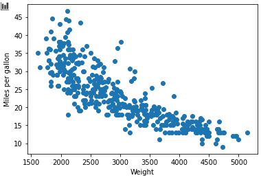
Okay, looks like a pretty strong negative relationship: the greater the car's weight, the lower its fuel efficiency. So let's formalise this correlation with a Pearson correlation coefficient!
Calculating the coefficient
This is stupidly easy, really. We use scipy.stats.pearsonr, and pass in the response and explanatory variables:
stats.pearsonr(mpg['mpg'], mpg['weight'])
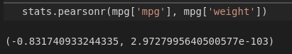
Two numbers are returned: Pearson's correlation coefficient r, the its associated p-value.
As we predicted, there is a strongly negative correlation between a car's weight and its fuel efficiency:r = –0.83. The p-value of 2.97e-103 means that it's virtually impossible that this is due to chance alone.
Finally, let's just square the coefficient. stats.pearsonr returns a tuple of length 2, so let's just get the first element of that tuple (which is r) and square it:
stats.pearsonr(mpg['mpg'], mpg['weight'])[0] ** 2Our r2 value is about 0.69. This means that about 69% of the variation in fuel efficiency can be explained by the weight of the car! In other words, if we know the weight of a bunch of cars, we can predict about 69% of the variability in their fuel efficiency. Nice.
You can find all the code used in this post here.